Saturday, March 31, 2012

Editing

Invariably, there will be some changes requested by the Art Director or Editor.  Do not take offense at these.  You're still awesome!  Trust that the AD or Editor know their market, and respect their expertise with humility and grace.

With my book, Sensing Peace, we had decided that one of the interior pages would double as the cover.  The Editor liked the picture of all the children eating ice cream and cookies, but using it the way it was designed would not allow space for the title.  Things had to be moved around.  This is the time I am so grateful for computers!  The image was already scanned in, so it was just a matter of cutting, pasting, and rotating.  And for ease in editing, here's a fun little trick I learned from my friend, Maryn, a Photoshop guru.  If you want to lift your drawing from the paper and turn it into floating lines with a transparent background, follow these steps (for Mac users):

1. Be sure your image is in RGB or CMYK mode.  You can check by selecting Image>Mode, and make sure there is a checkmark next to "RGB Color" or "CMYK Color."

2. Go to your Channels palette (found under "Window" if you don't already see it on your desktop).  Hold down your command key and click on the top channel in the list, which will be labeled either RGB or CMYK.  That will select all your white space.

3. Hold Command, Shift and hit "I" to inverse the selection.  Now your lines are selected.

4. Create a new layer.

5. Make sure your brush color is black, and with the fill tool, click on your image.  You have now created a layer of just your lines.  You can clear the image on the background to have a clean white "paper" layer behind, or delete the background layer entirely to make it transparent.

I find having just the lines is easier when I'm repositioning elements because the white of the "paper" doesn't overlap and block out areas around the piece I'm moving.

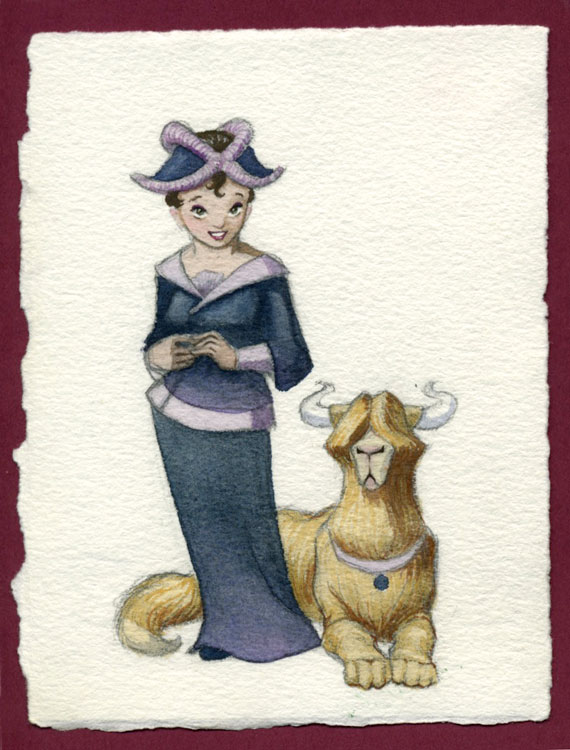
With a little editing in Photoshop, I got my characters all moved into an arc across the bottom of the page, leaving room for the page text or the title at the top so it could be used for both.  Then, just to be sure I knew where I was going, I did another outline drawing of the page using an art tracer.  I could have just done this in Photoshop, but I wanted the drawing quality to be consistent with my other comps.  While doing this final drawing, I also flipped two of the characters so the girls and boys weren't all on the same side, and filled in details which had previously been outside the frame.  I scanned that image in and sent it to the Editor for approval, along with a few other changes they had requested.  Once everything was approved, it was on to the painting!  Huzzah!


Thursday, March 29, 2012

Comps

My next step in illustrating a children's book is drawing comps.  Since I have my handy storyboard template laid out in InDesign, I like to grab each double page spread and upscale until the pages are about 25% of the finish size.  That usually gives me about 2 spreads per page.  You may recall from my last post that I have already placed my text, so that will upscale as well.  I can tweak as necessary, based on my design decisions and the font type and size information I have obtained from the publisher.

Next I print out these pages and make more careful drawings based on the thumbnails I already did.  Now I worry more about detail and carry over the composition and value decisions I had already made.  These are what the client will see, so I have to solve a lot of things.  When I'm just sketching for myself, I may do a scribble for a hand or a face, but now I need to really show the way it will look in the finish.


This is also the point at which I need to get and use any reference photography I need.  I work a lot from my head, but there are things I'm not familiar enough with, or poses that are tricky enough that I have got to get some good reference.  The internet is a wonderful resource these days!  It used to be that an artist would fill a filing cabinet with pages torn from magazines just to have images on hand.  Now all we have to do is google what we want and have millions of images to choose from.  Just be sure you don't plagiarize.  Use the images as guidelines, never copy them outright.  And to play it completely safe, take your own pictures.  (My own kids and husband make great models!)  If you aren't using your own family, always get permission (especially from parents of young children) and use a model release.

Once all the images are rendered, I scan them in, clean them up and send them along to the editor for feedback.

Monday, March 26, 2012

Storyboards

Storyboards are an essential way for both movie-makers and illustrators to see a wide-angle view of their whole project, work out timing, and make sure the story is cohesive from beginning to end.

Children's books are generally 32 pages long.  That includes 1-6 pages of end pages and front matter such as copyright info, dedications, and one or two title pages, so in the end, there are usually only 26 pages for actual story.

When I get the text for a book, the first thing I do is mark the page breaks and jot down some image ideas.  Then I pull out the storyboard template I created in InDesign and adjust the box dimensions to fit that of the finished book.  Here's a basic pdf version you can use:
I also like to figure out where the text is going to go on each page, so I will cut and paste it right into my thumbnails like this:
It's too tiny to read at this point, but when I do my larger comps, all I have to do is scale the image up and the text is already in place.  I mark off the end pages and front matter, so this usually puts us starting the story on page 6.  At this stage of drawing, it is best to work very small and focus on composition rather than detail.  I also like to decide at this point where I will have double page spreads, full bleeds, borders, or vignettes.  I try to keep a variety of angles going on to keep things interesting.  In the end, I have a nice idea of how the book will flow.

Here's an example of the storyboards I did for the book, "Sensing Peace."  


Some of the images underwent major changes before it was published, but in general we stuck to this plan.


Friday, March 23, 2012

The Stupid Fund

I used to have an expense category in my financial software which I called "The Stupid Fund."  It was for things like parking and traffic tickets, library late fees, and the like.  I no longer budget for stupidity, but from time to time, I am still stupid.  For instance, I recently incurred a ticket for speeding.  It was totally dumb, I'm not even going to bore you with the details.

In an attempt to defray the cost of my stupidity, I am offering a few original paintings and a sketch for sale.  Selling my originals hurts me more than the money would, but I would rather bear the punishment myself than punish my whole family by spending our money. Therefore, I have listed these four items on my Etsy shop, Lady Rachel's Garden.  I am also willing to produce prints of these or anything on my website for a lesser price.  Just contact me and we can talk details.

If you are not interested but you know of anyone who would be, would you please pass along the info?  I would be much obliged!  Thanks a million, and may your travels always be non-stupid, and ticket-free!

Wednesday, March 21, 2012

Solving It

I think my biggest problem as an artist is, I'm impatient.  I can't wait to get out my paints, spritz them down and see them sparkle, smell the wet paper and the gum tape, and lay down that first saturated wash of color.  Sometimes being able to work fast has been an advantage and earned me a good reputation, but I have learned, especially as a watercolorist, that thorough planning saves me a load of anguish.  I have to be disciplined and solve all my composition, value, color and shape problems while still in sketching mode.  That means a lot of experimenting.

My son's name means "armed defender."  I did my first sketch for his name painting several years ago.  I started with the most obvious idea.  Armed defender.  Check.  But it felt very stagnant.  I added something in the background for him to defend, something cathedral-ish to represent faith and church.  I let it rest.

By the time I picked it up again, my son was old enough to offer his opinion.  He wanted a dragon.  That was no problem.  I've always enjoyed drawing dragons, so I thought, why not?  But it seemed a little crowded having the dragon and the defender sharing the space equally, and all the poses I was coming up with were too melodramatic.  Again, I put it down for a while.


As I started thinking about this image again, I had a clearer idea of how I wanted to do the dragon.  I wanted more of a silhouette against a large red-orange sun, with minimum rendering of the form.  That meant the silhouette had to be really interesting.  I tried a few different neck & head positions, looking for just the right suggestion of motion and ferocity.  Even sketched in my Franklin Planner... (gotta love the quote about cookies and a nap at the top of the page)


I wanted the dragon to look fierce, like it was striking, not coiling back.  I finally felt good about having a more downward thrust to his pose.  Then I drew this little sketch with more of an S curve. 

The last thing to solve was my guard dude.  I had always tried to show him from the front or the side because I thought it would be more fun to design his helmet and his breastplate, but with the dragon in the background, I couldn't very well have his back turned to the enemy.  This is the kind of guy that would face the threat head-on.  So I had to get over the need to show his front.  (Some things are hard to let go, but that's what makes for bad paintings and bad movies, too!)  I also had to figure out the type of weapon he would have.  Guards often have big spears, so I chose to go with a spear-like axe (what is that, a halberd?).  In previous versions, the weapons were at various angles, kind of a poised-to-strike position,  but in the end I decided a solid vertical line would better portray strength.  That coupled with the stable triangle of his legs would give a sense of solidarity.  I threw in just a hint of a crenelated wall to give the idea that he is defending a building instead of just meeting his foe on the open battlefield.  And who doesn't love a nice, billowy cape?  
I don't know when I'll have time to paint this one, but it warmed my heart that my son couldn't suppress his grin when I showed it to him.  Mommy done good.

Monday, March 19, 2012

A Child's Perspective

At an illustrator's workshop I attended last month, we were advised to write as much from the perspective of the child as possible.  That way they can relate to the story better.  For instance, if you were writing about something that happened to you as a child, it's better to write the narrative as if you were still the child instead of as an adult looking back.

Being a mother of young children keeps me well in tune with that phase of life.  I'm often highly entertained by the off-the-wall things they come up with.  For instance, this week at a parent-teacher conference, my daughter's teacher handed me a little piece of her work.  In light of the advice I mentioned, I thought it would be funny to share it with you as an example of what a child's perspective might look like:

Now, normally, I don't go for the barfing kind of humor, but this one made me laugh right out loud!  Kids.  I love 'em.

Friday, March 16, 2012

My Blog Duality, Explained

For those who are curious, I thought I'd take a brief moment to clarify some things about my blogginality.  I have two blogs.  My first blog (which I started about a year ago) is called "The Only Thing Constant."  It's kind of my stream-of-conciousness-about-life type blog.  I share stories of things that happen to me and my family, or thoughts and observances about...well, whatever I feel like saying something about.  Parenting, religion, popular culture, etc.  My life has been in ways kind of unique, and I guess I thought people might like a little peek in on our experiences.  I don't know how much wisdom exists in this muddled narrative of mine, but it is my humble gift to the internet, hopefully useful and uplifting, or at least just amusing.  I try to post once a week, typically on Sundays.

This blog on the other hand, I try to dedicate more strictly to art and creativity.  I started it up just about a month ago, and I mean to post about three times a week, as long as I can keep that up.  As I mentioned in my first post, I enjoy many creative outlets, and I prefer not to have a hard dividing line between the art I do on paper and the art I do, say, while cooking in the kitchen, or coaxing growing things into bloom.  Still, I will try to post mostly about traditional art and illustration, as I imagine that is what my audience is coming here for.

So now you know.  I apologize if that's confusing and if I've complicated your life by giving you TWO blogs to keep up with, but really, I'm flattered if you care enough to read even one.

Wednesday, March 14, 2012

"What's in a Name?"

I have long been interested in the meaning of people's names.  Parents may pick a name for their child because they like the sound of it, or to honor a significant person or family member.  But all names have an origin and a meaning, and for some reason, I like finding that out.

As an illustrator, that has translated into creating paintings based on the meaning of names.  I started with my own daughter.  Her name means "noble strength."  We chose her name before we found out the meaning, but were delighted once we did because it fit her perfectly.  Here's the painting I did for her:

I've also done this one, which I've given as a gift to both a Caitlin and Karey, because their names both mean "pure."

I've also been working on the name Joseph, which means "God will provide."  I used Joseph of Egypt as the focal character in this sketch to demonstrate the way God used Joseph, despite his many trials, to provide for both Egypt and the house of Israel during the great famine.  

Did Jacob and Rachel know their son would do that when they held him as an infant and gave him his name?  Well, Jacob was a prophet, so maybe he did.  But I'm sure there were many times Joseph wondered why all those terrible things happened to him, and how it was that God would provide.  Sitting forgotten in the dungeons of a foreign land, he could never have imagined the miraculous change of circumstances that would follow, and how all his trials were leading up to a very significant purpose.

Monday, March 12, 2012

Orchids!

Check out the shimmer on these petals! (click for detail)

I confess: I'm addicted to orchids.  Incurably.  I don't think I can pass one in the supermarket without stopping and looking at it and checking the price tag.  Usually I can resist, occasionally I fail.  My addiction is so bad that it has rubbed off on my husband.  It's probably worse for him, because he can justify himself by saying he's just buying it for me.  He's going down with me.

In my defense, I must say that this winter has been the least gloomy of any I can recall, and I would have to say the reason is my orchids.  Anyone out there who has trouble with the post-Christmas winter-time blues, here is my recommendation: get an orchid!  These beauties bloom right when winter is the bleakest, January through March, and by the time their blooms start to fade, it'll be green and warm again outside.

Although my oldest orchid dates back 5 years, this is the first time I have had any of them re-bloom.  I credit the sunny southern window in our new house, and faithful watering and spritzing.  As a result, it has felt like a little tropical paradise in our home, with anticipation sweetening each day as we wait for the next bud to pop open.

What does this have to do with art?  Well just look at these masterpieces:

This one is Dallyn's favorite.

My magnificent white.

My cute mini phal.  These blooms are less than 2 inches.

I justified buying this one as decor for a "Vanilla Party."  Did you know vanilla comes from an orchid?

This is a new acquirement.  Dallyn got me my first cattleya for Valentines Day. 


We keep these two on our dining table.  That white one has thirteen blooms, the largest measuring almost five inches across.  The first bud opened at the beginning of February, and the last one just opened this past week.  It can't be described as anything less than magnificent.  Could a wonder such as this have come about by pure chance?  I think not.  That creation was made by a Heavenly Artist.  I am honored to have one of Father's original masterpieces sitting on my very own table every day.

Friday, March 9, 2012

Happy Misfortunes

I once left some of my college artwork lying on the floor at my parent's house and one of my favorite paintings got wheeled over by an office chair.  It ripped the paper right in the middle and did irreparable damage.  I was heartbroken.  About five years later, when both my art and my sense of responsibility had matured somewhat (meaning, I knew not to leave paintings on the floor any more) I decided to repaint the image.  In the end, I have to admit, I am glad the original was damaged because the second painting was far better than the first:

Now that I look at it, I wonder why I liked the first painting so much.  For one thing, the first image was done in oil, which I was never very good at.  During college, as every student should, I was still dabbling in various media, trying to find what I liked.  As much as I loved the look of oil paintings, mine always came out looking too squashy or blurry or muddled.  I also still had a few things to learn about the human form and drapery and using reference.  In the second version, I had settled into watercolor as my medium of choice and had a few years of good solid experience with it.  I was more aware of using an interesting sense of form, especially in her hair, and raised her eyelids so we could see her eyes better.  In the first version, even though I knew she was looking down at the snowflake, many people I showed it to thought her eyes were closed (funny how we see our paintings so differently sometimes).  I also tossed in some rosy reflected light to add a little warmth to the otherwise monochromatic image.

My lesson learned: take disasters and run with them.  I've had a couple paintings "ruined" by my own mistakes or the interference of little hands, such as those of my 3-year-old who thought the white space I saved in the middle of what was to be a yellow-centered flower needed a good splash of red.  When I came back to my desk and found his addition, my first reaction was naturally one of distress.  After my efforts at retouch failed to eliminate that red tinge, I learned to incorporate it, and I felt the flower looked much better in the end.


I find it's the same in life.  Sometimes bad things happen that end up leading to good things.  So here's to little disasters.


Wednesday, March 7, 2012

Sissy Ol' Dance Class

A couple weeks ago, my daughter's two leotards mysteriously disappeared.  I searched every conceivable place, over and over, ad nauseum.  I was ready to pull my hair out.  She and I were both praying earnestly that we would find them because she had an important audition coming up in her dance class, and her teacher had made it clear that appropriate dress was mandatory.  I was not about to go out and slap down another 30 dollars for a new leotard.  I racked my brains trying to recall the unusual circumstances surrounding the last time I had seen them:  I was pretty sure I had done her laundry the day after the last dance class she had worn a leotard to.  I vaguely remember pulling her leotards and tights out to drip-dry, but oddly enough the washer had overflown, so I called our plumber over to snake the drain line...  Maybe the plumber stole them?

As ludicrous as that seemed, I was so desperate that I was even working out a dialogue for a phone call to at least call and ask if he remembered seeing them.  Nothing was sounding very coherent.

So this morning I was collecting my 5-year-old son's laundry when I noticed a wad of something pink peeking out from under his pillow.  There they were, both leotards and three pair of tights, wrinkled and forlorn, but not pinched by the plumber.  I asked my son about it, and why he didn't speak up when he knew we were looking for them.  "I didn't know they were called leotards."  And then the million-dollar question, "Why did you do it?"  His answer: "I don't like driving to dance class.  It's boring."  So I guess he figured if he hid her dance clothes, we wouldn't go to dance.  I can just envision his golden moment when he saw the leotards hanging there, and the little light came on in his head.  How disappointed he must have been last week when we went anyway, my daughter in Jazz shorts and a t-shirt.

Maybe there's a children's book in there...