Wednesday, August 29, 2018

Markers!

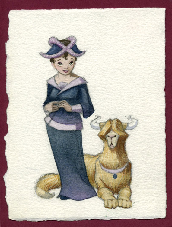
About four years ago, I think it was, my brother Jon insisted that I try out his Copic Sketch Art Markers. I am primarily a watercolorist, but even then I hadn't picked up a brush very often for many years since my biggest project has been raising five busy children. I felt a little intimidated not only because I was terribly rusty, but because I hadn't tried a new medium probably since college, roughly fifteen years before. Jon had been playing with these markers for a while and was really enjoying them, and he had a hunch I'd enjoy them, too. So, swallowing my pride, I started a preliminary sketch. I asked my brother's help in refining some steampunk details and adding some flair to the costume (my ideas were so dried up!) My hands shook a little when I did the outlining, and then I dove in with the markers. Nerve-wracking. But in the end, I had to admit, it was super fun, and I really enjoyed the result!
Looking over our shoulders was my other brother, Jim, and his wife, Angie. They had been playtesting a pirate-themed card game which they had invented for several years and had talked a little with me about their hopes to get it ready for publication. They had also asked if I'd be willing to do the artwork. Now, seeing this new style I was working in with the markers, they said this was perfect for what they had in mind for the game. We made a deal: if they would buy me a complete set of Copic Ciao Markers, I'd do the job. So over the next several months, I had plenty of practice as I created about 20 characters for the game "All Hands on Deck." 


Ciao Markers are the cheaper version of Copic's Sketch line of markers, though it really doesn't feel like a downgrade. They have the exact same ink, they are refillable, and they have the dual chisel and brush tips just like the sketch markers. The only real differences as far as I know is that they come in fewer colors and don't hold as much ink. The first difference could be overcome if you really wanted to by purchasing the Sketch ink and just refilling one of your empty Ciao markers, though I feel like the 180 colors in my set pretty much cover the gamut of what I need. As far as not holding as much ink, I haven't run out of anything yet, and it's been 4 years.


I've done a lot more marker art than watercolor since then. Watercolor is still my first love, but it does take a lot more time. You have to stretch the paper, get out the palette and water jug and spray bottle and paper towels, keep your brushes washed and conditioned, and there's that whole waiting for watercolor washes to dry issue. Markers are less of a hassle. The colors are so bright and bold and fun, and there's nothing to clean up when you're done, except maybe the pile of markers you've strewn all over your desk... Markers are a tremendously versatile medium, they just take a little getting used to.

Thankfully, I also started my comic strip a couple years ago, and that really helped me build my confidence in inking. You can really see the progression of sketchy, nervous outlines in my beginning comics (which I did on purpose to mimic pencil sketching, something I felt much more secure in) to a smoother more confident line in my more recent strips.

My point? Don't be afraid to try new media! Give it some time and practice to build your confidence. And listen to your younger siblings! Sometimes they totally know what's up.

Thursday, April 9, 2015

Love your books a little longer: How to fix a ripped book spine

One of my very favorite college classes was bookbinding. If I had time for a hobby (and I hope I will someday) this would be it. And although I can't really claim to be an expert, it has certainly come in handy over the years, mostly in the way of repairs. I can't tell you how many times I have been tempted to kidnap hymnals from church to take them home and fix them up. I just ahve to remind myself that with 5 kids and a houseful of books I have an ample supply of repairs right here at home. Many just get the tape treatment. For board books that just need to last through one more toddler before it hits the donate box, strapping tape will do. If I'm feeling generous it'll be archival acid-free scrapbooking tape. But there are a few that get the royal treatment.

Back in the day, books were made to last. "Paperbacks" did not exist. Spines were carefully and lovingly stitched together and bound with sturdy, precisely cut and placed materials. The weakest joints, where the spine meets the board, would always be made from cloth or leather that resists tearing. Somewhere over the past few decades, we traded quality for cheap, fast production. While books are more available and affordable, they are also more disposable. My kids think I'm the worst mom ever because I refuse to buy books from the book fair or those monthly catalogs the schools send home. Naturally, I want my kids to read, and I used to buy those books, but they are some of the worst made books on earth and I don't see how a flimsy, tear-apart book is going to get my kids excited about reading. Even when we invest in a hard bound book, though, it's hard to find one that is built to last. The boards are commonly held together with no more than a thin piece of paper. I don't know about you, but since I was a kid I have folded paper to help it tear more easily. So guess what? Paper endpages which are always folded at the joint of the spine are going to tear!

We got this book for our son for Christmas a couple years ago. We were in the height of our family "Zelda" kick, having just gotten our first gaming system a year or two before. It was one of those finds online that you're just like, "that's the one!" We were so excited to give it to him, and we emphasized the importance to taking good care of it. Well, you know how that goes, and pretty soon it was getting left around, borrowed by younger siblings, and in general mis-treated. Inevitably, the spine ripped. I gingerly set it aside and promised to repair it. I was going through my kid's books today looking for give aways when I realized I'd better repair it so I can keep it with a clear conscience. I decided to blog about it in case anyone else needs to repair a hardbound book.


Here are the materials needed for this project: binding cloth in a color that looks great with the book cover (I found a nice green that was nearly a perfect match), PVA glue, a 1/2"-3/4" wide paint brush, a cutting board, x-acto knife, metal ruler, and possibly binder's board, if the spine board is damaged or missing. Most of these materials can be found at a nicer art supply place like Blick, or I'm sure you can find them online. PVA is a special archival glue made specifically for book binding. If you don't care as much about the longevity of the book (if it only needs to last until your kids outgrow it) common white glue would work just as well.


My first step was to cut the spine board from the book. It was only attached on one side. If I wanted to cover the entire spine, I could have left it attached, but I wanted the title to be visible. I repaired another book once by cutting a hole in the binding cloth to fit around the text on the spine, which worked okay, but this book had much more text and image to dodge.

So this time, after cutting off the dangling spine, I used my x-acto blade to carefully peel the paper off the spine board and set that aside for later. If your spine board is damaged, bent, or missing, you will want to cut a new one from binders board. It should be as tall as the cover boards and a little narrower than the thickness of the book.

Once I had the paper off the spine board, I cut a piece of binding cloth a couple inches wider on each side and at least half an inch wider on the top and bottom. I brushed the board with PVA glue and placed it in the center, pressing it on tightly. Once that was dried, I tested the wrap around to make sure the cloth wasn't going to cover up the gold image on the front, and had to trim back one side to allow for that. Next I cut slits in the cloth straight down from each of the corners, starting at a distance about the thickness of the board away from the edge of the board. I used my metal ruler pressed right against the long edge of the board as a straight edge. Next I cut a diagonal slit out to form little notches. (In hindsight, I should have cut them more square to compensate for the thickness of the book cover, which was slightly padded.)


I Brushed the two smaller tabs at the top and bottom with glue and wrapped them over onto the underside of the board, pressing down tight. The remaining tabs will tuck around onto the inside end pages after it is glued in place.


Since the boards on my book were tearing away from the end pages, I needed to glue those back down. Apply glue and brush on, making sure you pull the glue all the way to the edges. Press the book closed, weigh it down and leave it for a few hours. If your weight is not bigger than the book, use a large rigid board to help distribute the weight.


Once that has set, it is time to glue on the spine board. Lay it flat and wrong side up on a clean piece of scrap paper. Brush glue on all the wrong-side surfaces of the binding cloth, pulling the glue all the way past the edge and onto your scrap paper. This will ensure the glue goes all the way to the edge. Be very careful if you move the cloth that you always move it away from the area that has been brushed with glue to avoid getting any on the reverse.


Stand the book on its edge, spine up, and position the spine board in place. It is important to position it this way rather than lying the book onto it flat so the spine ends up centered. Pull the cloth down over the sides in the middle, then tug gently and press it down all along the sides. The cloth has a little stretch, so you may need to press and tug it a little to get the edge straight.


When it looks right, tuck those tabs around to the inside and press them down as well.

Close the book again and allow the glue to dry. After that has set you should inspect the end pages for wear. Since my book's tears we minimal and I didn't want to cover the lovely gold accented image up, I just decided to leave it be. If there is enough ripping, you will want to put in new end pages, or at least a strip of paper wide enough to cover the center seam as well as both the tabs of binding cloth. Cut precisely to the height of the book and the width you want, brush with PVA glue and press on. You can use a bone folder to press out any bubbles, but you should protect the paper from burnishing by covering it with a clean piece of paper before you do. Once again, close the book and weigh it down while drying.


The very last step for me was to trim the strip from the original spine with the title on it and glue it to the cloth spine. Again, the glue should be allowed enough time to dry before the book is handled. The finished product feels even more sturdy than the original and should last a good while. Back on the shelf it goes, and hopefully this time it will be treated a little more lovingly!


Friday, February 6, 2015

Website Makeover!

Every once in a while, in what can only be called a fit of creative insanity, I throw all my daily responsibilities aside and give my website a makeover. This one was long overdue, and I'm very happy with the new look!  I've also added some of my more recent work. Hope you enjoy!

Monday, February 25, 2013

Gingerbread House


The grocery store I shop at has an annual gingerbread house contest, prize being $500.  I had never made a gingerbread house before, but last year I thought to myself, "I'm an artist.  How hard can it be?"  So I designed and built one for the Christmas of 2011.  It was loads of fun.  I wanted to depict a scene that embodies the best of the Christmas spirit: that of giving secret service.  It built a skeewampus log cabin using chocolate licorice for the logs walls.  There was a little family on the doorstep, having just discovered the basket left by two others peeking around the corner.  The chimney has a bird sitting on top, wings wrapped around him to show there's no fire in the fireplace.  I had such fun making it.

When we delivered it for the contest, I was proud and nervous.  But my heart sank when I saw the enormous replica of the Provo Tabernacle, a historic and well loved local landmark that was destroyed in a fire a year ago.  Every roof tile was laid with necco candies.  It must have been 4 foot square.  It was beautiful.  I almost backed out the door with my little cabin.  But I left it anyway.  The tabernacle won the grand prize.  It was a given.

But I got to take my little cabin home and enjoy it with my family.  When Christmas was well over, a dear friend told me I should keep it instead of throwing it away.  It sat on my counter for a few months before it started to fall apart, and I knew there would be no safe place to store it, nor did I want to bother piecing it back together.

So finally one morning, I let me kids dismantle it.  It was a little disturbing the delight with which they ripped it apart.  It was reduced to rubble in less than 10 minutes.  My happy little gingerbread family still smiling at me from the bottom a plastic bag.  Sigh.  Such is the transience of art.  Rumor has it a retired comic artist I admire who has turned to landscape painting burns his paintings as soon as they are done.  No one can say for sure because he lives a pretty secluded life.  Maybe he doesn't want them sold on e-bay.  Maybe he just doesn't want to dwell on the past.  Maybe he doesn't like them.  Or maybe he wants to motivate himself to do the next painting.

Friday, May 18, 2012

On Break


This is the only creative project I will be working on for the next several months!  This little nubbin is taking all my creative juices at the moment, so I'm putting this blog on hold until further notice.  I may or may not continue to post occasionally on my other blog, The Only Thing Constant, which focuses a little more on life insights and musings (as experiences like this often cause lots of musings) but this blog will go untouched until I can resume some semblance of a career to talk about.

Cheers!

Sunday, April 1, 2012

In the Off Season

With Easter now past us, I had to pull out this little homage I did, honoring all the holiday heroes who have to make ends meet during the rest of the year.  I threw in the Boogey Man and the Tooth Fairy for good measure, because when kids grow out of that phase, they're out of work, too.  What sort of jobs do you think they'd be good for?

Saturday, March 31, 2012

Editing

Invariably, there will be some changes requested by the Art Director or Editor.  Do not take offense at these.  You're still awesome!  Trust that the AD or Editor know their market, and respect their expertise with humility and grace.

With my book, Sensing Peace, we had decided that one of the interior pages would double as the cover.  The Editor liked the picture of all the children eating ice cream and cookies, but using it the way it was designed would not allow space for the title.  Things had to be moved around.  This is the time I am so grateful for computers!  The image was already scanned in, so it was just a matter of cutting, pasting, and rotating.  And for ease in editing, here's a fun little trick I learned from my friend, Maryn, a Photoshop guru.  If you want to lift your drawing from the paper and turn it into floating lines with a transparent background, follow these steps (for Mac users):

1. Be sure your image is in RGB or CMYK mode.  You can check by selecting Image>Mode, and make sure there is a checkmark next to "RGB Color" or "CMYK Color."

2. Go to your Channels palette (found under "Window" if you don't already see it on your desktop).  Hold down your command key and click on the top channel in the list, which will be labeled either RGB or CMYK.  That will select all your white space.

3. Hold Command, Shift and hit "I" to inverse the selection.  Now your lines are selected.

4. Create a new layer.

5. Make sure your brush color is black, and with the fill tool, click on your image.  You have now created a layer of just your lines.  You can clear the image on the background to have a clean white "paper" layer behind, or delete the background layer entirely to make it transparent.

I find having just the lines is easier when I'm repositioning elements because the white of the "paper" doesn't overlap and block out areas around the piece I'm moving.

With a little editing in Photoshop, I got my characters all moved into an arc across the bottom of the page, leaving room for the page text or the title at the top so it could be used for both.  Then, just to be sure I knew where I was going, I did another outline drawing of the page using an art tracer.  I could have just done this in Photoshop, but I wanted the drawing quality to be consistent with my other comps.  While doing this final drawing, I also flipped two of the characters so the girls and boys weren't all on the same side, and filled in details which had previously been outside the frame.  I scanned that image in and sent it to the Editor for approval, along with a few other changes they had requested.  Once everything was approved, it was on to the painting!  Huzzah!


Thursday, March 29, 2012

Comps

My next step in illustrating a children's book is drawing comps.  Since I have my handy storyboard template laid out in InDesign, I like to grab each double page spread and upscale until the pages are about 25% of the finish size.  That usually gives me about 2 spreads per page.  You may recall from my last post that I have already placed my text, so that will upscale as well.  I can tweak as necessary, based on my design decisions and the font type and size information I have obtained from the publisher.

Next I print out these pages and make more careful drawings based on the thumbnails I already did.  Now I worry more about detail and carry over the composition and value decisions I had already made.  These are what the client will see, so I have to solve a lot of things.  When I'm just sketching for myself, I may do a scribble for a hand or a face, but now I need to really show the way it will look in the finish.


This is also the point at which I need to get and use any reference photography I need.  I work a lot from my head, but there are things I'm not familiar enough with, or poses that are tricky enough that I have got to get some good reference.  The internet is a wonderful resource these days!  It used to be that an artist would fill a filing cabinet with pages torn from magazines just to have images on hand.  Now all we have to do is google what we want and have millions of images to choose from.  Just be sure you don't plagiarize.  Use the images as guidelines, never copy them outright.  And to play it completely safe, take your own pictures.  (My own kids and husband make great models!)  If you aren't using your own family, always get permission (especially from parents of young children) and use a model release.

Once all the images are rendered, I scan them in, clean them up and send them along to the editor for feedback.

Monday, March 26, 2012

Storyboards

Storyboards are an essential way for both movie-makers and illustrators to see a wide-angle view of their whole project, work out timing, and make sure the story is cohesive from beginning to end.

Children's books are generally 32 pages long.  That includes 1-6 pages of end pages and front matter such as copyright info, dedications, and one or two title pages, so in the end, there are usually only 26 pages for actual story.

When I get the text for a book, the first thing I do is mark the page breaks and jot down some image ideas.  Then I pull out the storyboard template I created in InDesign and adjust the box dimensions to fit that of the finished book.  Here's a basic pdf version you can use:
I also like to figure out where the text is going to go on each page, so I will cut and paste it right into my thumbnails like this:
It's too tiny to read at this point, but when I do my larger comps, all I have to do is scale the image up and the text is already in place.  I mark off the end pages and front matter, so this usually puts us starting the story on page 6.  At this stage of drawing, it is best to work very small and focus on composition rather than detail.  I also like to decide at this point where I will have double page spreads, full bleeds, borders, or vignettes.  I try to keep a variety of angles going on to keep things interesting.  In the end, I have a nice idea of how the book will flow.

Here's an example of the storyboards I did for the book, "Sensing Peace."  


Some of the images underwent major changes before it was published, but in general we stuck to this plan.


Friday, March 23, 2012

The Stupid Fund

I used to have an expense category in my financial software which I called "The Stupid Fund."  It was for things like parking and traffic tickets, library late fees, and the like.  I no longer budget for stupidity, but from time to time, I am still stupid.  For instance, I recently incurred a ticket for speeding.  It was totally dumb, I'm not even going to bore you with the details.

In an attempt to defray the cost of my stupidity, I am offering a few original paintings and a sketch for sale.  Selling my originals hurts me more than the money would, but I would rather bear the punishment myself than punish my whole family by spending our money. Therefore, I have listed these four items on my Etsy shop, Lady Rachel's Garden.  I am also willing to produce prints of these or anything on my website for a lesser price.  Just contact me and we can talk details.

If you are not interested but you know of anyone who would be, would you please pass along the info?  I would be much obliged!  Thanks a million, and may your travels always be non-stupid, and ticket-free!

Wednesday, March 21, 2012

Solving It

I think my biggest problem as an artist is, I'm impatient.  I can't wait to get out my paints, spritz them down and see them sparkle, smell the wet paper and the gum tape, and lay down that first saturated wash of color.  Sometimes being able to work fast has been an advantage and earned me a good reputation, but I have learned, especially as a watercolorist, that thorough planning saves me a load of anguish.  I have to be disciplined and solve all my composition, value, color and shape problems while still in sketching mode.  That means a lot of experimenting.

My son's name means "armed defender."  I did my first sketch for his name painting several years ago.  I started with the most obvious idea.  Armed defender.  Check.  But it felt very stagnant.  I added something in the background for him to defend, something cathedral-ish to represent faith and church.  I let it rest.

By the time I picked it up again, my son was old enough to offer his opinion.  He wanted a dragon.  That was no problem.  I've always enjoyed drawing dragons, so I thought, why not?  But it seemed a little crowded having the dragon and the defender sharing the space equally, and all the poses I was coming up with were too melodramatic.  Again, I put it down for a while.


As I started thinking about this image again, I had a clearer idea of how I wanted to do the dragon.  I wanted more of a silhouette against a large red-orange sun, with minimum rendering of the form.  That meant the silhouette had to be really interesting.  I tried a few different neck & head positions, looking for just the right suggestion of motion and ferocity.  Even sketched in my Franklin Planner... (gotta love the quote about cookies and a nap at the top of the page)


I wanted the dragon to look fierce, like it was striking, not coiling back.  I finally felt good about having a more downward thrust to his pose.  Then I drew this little sketch with more of an S curve. 

The last thing to solve was my guard dude.  I had always tried to show him from the front or the side because I thought it would be more fun to design his helmet and his breastplate, but with the dragon in the background, I couldn't very well have his back turned to the enemy.  This is the kind of guy that would face the threat head-on.  So I had to get over the need to show his front.  (Some things are hard to let go, but that's what makes for bad paintings and bad movies, too!)  I also had to figure out the type of weapon he would have.  Guards often have big spears, so I chose to go with a spear-like axe (what is that, a halberd?).  In previous versions, the weapons were at various angles, kind of a poised-to-strike position,  but in the end I decided a solid vertical line would better portray strength.  That coupled with the stable triangle of his legs would give a sense of solidarity.  I threw in just a hint of a crenelated wall to give the idea that he is defending a building instead of just meeting his foe on the open battlefield.  And who doesn't love a nice, billowy cape?  
I don't know when I'll have time to paint this one, but it warmed my heart that my son couldn't suppress his grin when I showed it to him.  Mommy done good.

Monday, March 19, 2012

A Child's Perspective

At an illustrator's workshop I attended last month, we were advised to write as much from the perspective of the child as possible.  That way they can relate to the story better.  For instance, if you were writing about something that happened to you as a child, it's better to write the narrative as if you were still the child instead of as an adult looking back.

Being a mother of young children keeps me well in tune with that phase of life.  I'm often highly entertained by the off-the-wall things they come up with.  For instance, this week at a parent-teacher conference, my daughter's teacher handed me a little piece of her work.  In light of the advice I mentioned, I thought it would be funny to share it with you as an example of what a child's perspective might look like:

Now, normally, I don't go for the barfing kind of humor, but this one made me laugh right out loud!  Kids.  I love 'em.